Hi there! Since this is my first blog post on SLING’s blog, I shall start by introducing myself briefly. I’m Mabel and I just joined the team mid-March this year after completing my undergraduate studies in Canada. I had been working on the hawker study since starting work and recently completed the first round of survey data collection. And soon after, our grant application for the new study, KIDs In View, was approved! So Clarence, SLING’s principal investigator i.e. my boss, told the team to come up with a logo for the new project. After months of doing fieldwork, I’m ready for some fun task and thus decided to spend some time sketching out my idea.
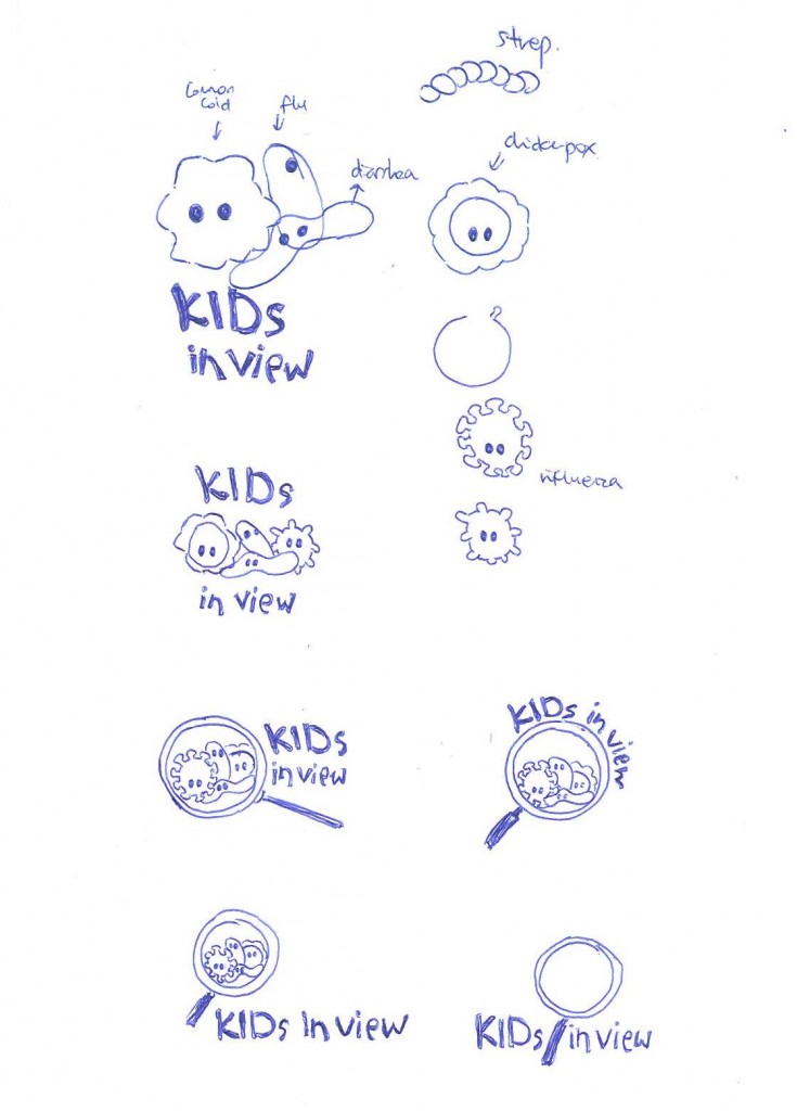
You can find out more about the KIDs In View study here but in short, the purpose of this study is to learn more about childhood respiratory viral infections through establishing a surveillance network for fever and respiratory symptoms among children at childcare centres. The “KIDs” in “KIDs In View” is actually an acronym for “Keeping Infectious Diseases (In View)”, so I thought maybe I would draw some cute virus creatures. “In View” and a surveillance network gave me the idea of having a magnifying glass that allows us to see the little creatures. So this is what I came up with:
I first drew out different viruses and actually got my inspiration from GIANTmicrobes® that are these weird but cute-looking plush toys versions of various bacteria, viruses, and cells. I also googled some actual images of respiratory viruses and came up with my own little influenza creature. And for the geeks out there, those little bumps are your neuraminidase (I apologize for leaving out the haemagglutinin – they’re not quite as cute).
And the rest are just random virus creatures I made up. The little peanut-shaped creature in the middle looks pretty generic and can most probably look like various viruses that weren’t magnify as much under the microscope. So after creating the bugs, I just added in the magnifying glass in various layouts and played with the “KIDs in view” wording. I brought the sketch to our team meeting and everyone quite liked it so Clarence told me to go ahead with it.
So I drew the one everyone liked best in pencil and then traced it with a black ink pen for scanning and image tracing.
Then I had to figure out how to use the scan function on my office printer (which I’m so glad didn’t take too long). And after that I moved on to googling “how to image trace sketches on Illustrator”. Really it was just opening up the scanned jpeg file in Adobe Illustrator CS6 and clicking on the button “Image Trace”. Super easy and user-friendly! As you can see, I’m not the best with technology.
The next part took the longest – finding the right colour combination for the logo. The sketch took me 2 minutes but it took me way longer hunting for a good colour combination. I’m a fan of pastel colours, so this was the first coloured draft.
My colleagues said the colours were nice, but they weren’t sure if this will turn out good on paper or if it’ll be eye-catching enough. They didn’t really like the jade green rim and black words too. And they recommended bright/bold colours and so…
 Yeah it didn’t really work out. Lesson learnt: bright bold contrasting colours aren’t going to work. So my next attempt was playing around with Illustrator CS6’s Color Guide using the tetrad harmony rules. Clarence’s son really likes the “pink puzzle piece” because he loves pink. Thus I decided to keep the “puzzle piece” pink-ish since it’s also nice to have a bright coloured creature right at the front of the logo. Choosing colours definitely took longer than I expected, so I salute all the graphic designers out there. But finally, after a lot of fiddling with hex codes, I decided to go with this colour template. It’s not really tetrad, but I think it works. (You can create your own colour wheel at https://color.adobe.com/create/color-wheel/!)
And TADAAA! The KIDs In View logo!
For those who made it to the end of this blog post, I shall offer you a sneak peek at our web logo! The website for this project is currently in development and will be made public once our project starts in Jan 2016. We’ll keep you updated!
Till then, bye!
~ Mabel


